Marketing is the way that the general public get to know about your beer. For a small brewery this means Facebook, Twitter, a website, beer blogs both your own and through other people (why do you think I'm writing this?), meet the brewer events etc. For big breweries it involves aspirational TV adverts and sports sponsorship. Marketing is a strategy and perhaps in another blog I will get into it in more detail, but I want to go on to talk about branding.
Branding is a subset of marketing and is most important at the point of sale. Many punters, in the absence of any prior knowledge about the beer, will pick an interesting looking pumpclip or a good looking bottle. What better way of marketing your beer then to have people buy it, try it and talk about it?
So what branding have we got at Weird Beard Brew Co? Well as you will see the branding has evolved somewhat from fairly basic beginnings.
The first thing was the name. This was an incredibly difficult thing to get agreement on. Weird Beard has had a few people involved with the project over the year or so we have been thinking about it.
We have a file with over 75 possible names in there that we considered. Some of those that got more than 10 seconds of thought are below:
Second Chapter (People may remember Tony Lennon @tony2taps tweeting about this)
Rhythm and Brews
Weird Beard Brew Co
Square Mile
Great Fire Brewing Co
The Craft Brewery (to annoy all the people who don't like the name craft beer)
Artisan Beers
Artisan Beers
Studio 56 Brew Co
Happy Bat (Yes Stig @thehappybat was involved as well)
Big Smoke
South Bank
Thames Brewery
Borough Brewery
Another Brewing Company ("can I have another beer please?")
Elephant's Trunk
New Agenda
SE1
Inner City Brew Co
Urban Brew Co
The 4 Idiots that can build a brewery but not think of a name brew co.
HELL FIRE!
We gave those in bold a bit more thought but it was only when it was down to Bryan and myself that Weird Beard Brew Co came out as a clear favourite. This was helped by Bryan going out and with the help of a mate designing a logo that worked:

Armed with a logo it was easy for me to dive into Photoshop and start designing beer labels for our homebrew beers. The font is sometimes know as Tim Burton but also the freely available as Trinigan FG and made for good title text.

The goal was for simple and striking. First feedback was writing text telling drinkers to store the beer upright should not be written vertically! Also note my (bad?) habit of replacing letters with clip art.
A few tweaks later, we had this. A version of this label had won the label competition at the LASECB Festival. Feedback on this label was good, but a few people complained about amateur look to it. The black and white printed at home look to be exact. Looking back I am not sure I agreed at the time but certainly do now. However a retro label may be in order if we do this beer as a special.
Again the attempt was to be simple and striking. I guess you can see Marble and Otley influences in this especially, although others have mentioned James Bond. Another change was to lose the fancy font for much of the writing, making it easier to read and allowing us to put it in a smaller font giving more space.


Is it better to have the beer name prominent or the brewery name?
I'm sure that the branding will continue to evolve. Any and all feedback is welcome and I will of course do a follow-up post closer to launch time with our launch range of beers and labels.
Surely Hell Fire was the best name "I am the God of Hell Fire and I bring you....Beer!!!!".
ReplyDeleteWell, OK then, Weird Beard Brew Co. is much much better, but you can't have a Prodigy intro when you have your Meet the Brewer events. Just saying :)
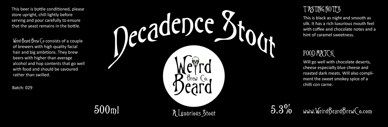
The labels are looking good and I guess you will know when you arrive at the production version. Get as many fresh designer eyes as you can to look at them, and when you get to the point that they are changing each others suggestions, you know you have it right already. Best looking labels in my opinion are the Decadence Stout and the Red Penguin. And for me, I would go beer name bigger than brewery name. The consistent brand will tell people which brewery it is. Really enjoying watching this unfold, good work!
I agree with Broadfordbrewer's comment. The Red Penguin and Decadence Stout labels are best looking to my eye. I also think the beer name looks better bigger.
ReplyDeleteI have a bit of a problem with pictures of hops on the label. I don't know what it is but it feels a bit like a bottle you might pick from a stall at village fete.
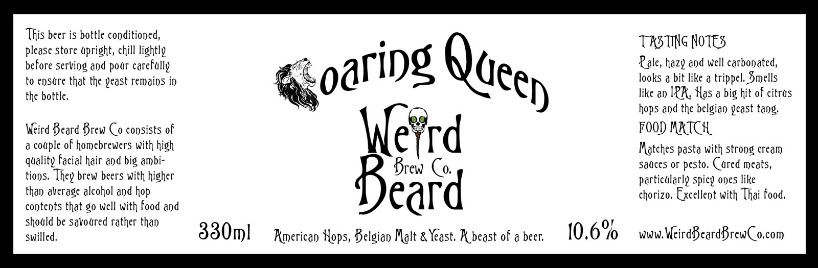
I hope that Roaring Queen is a real beer because it sounds fantastic from the label description. I can't wait to taste your beers!
Chipotle-infused Rauchbier sounds absolutely amazing!
ReplyDelete@Broadfordbrewer I liked Hell Fire and Great Fire, but that was the problem with 4 heads all having different ideas. Could have used that Fire background on all the labels and the idea of coming to meet the brewer events like a boxer to a ring amuses me somewhat.
ReplyDelete@Sam Roaring Queen is a real beer, unfortunately I just finished the last bottle over the weekend. I really must brew it again though. RedPenguin and Decadence are likely to be core beers and I was thinking of fairly simple labels for these so happy that there is approval for them.
@Gareth It tasted pretty good on bottling this weekend. I had to blend it 50:50 with the main Ruachbier as it was just stupidly hot. I wanted it to be actually drinkable in more than just a few sips at a time. Still there are only 16 bottles of it, and at least 4 of those are spoken for, so it may be hard to come by.
Cheers all for the feedback, keep it coming all very useful.
I really like the fire and smoke labels. I agree that they could be used for t-shirts. The red penguin is also cool. I also think the beer name should be bigger then the brand name. I think it is a great project what you guys are up to. It will be great to try your beer in the future.
ReplyDeleteCheers SW6B It does seem that consensus is beer name bigger.
ReplyDeleteI am glad you take pride in what you write. This makes you stand way out from many other writers that push poorly written content.
ReplyDeletebeard oils
School education continued to face similar problems as previous years as the School Education Department (SED) failed to achieve its own targets.
ReplyDelete8th class result roll no
online result 5th class 2018
8th class result 2018